A Ben Cohen Ink Comic

SHAMEFUL STORIES, PRESENTED IN A MOST SHAMEFUL MEDIUM,
OR DOES THE SHAME LAY MERELY IN OUR PERSPECTIVE, OR PERCEPTION OF SHAME.

By Ben Cohen a “legendary master of the left field.” -BRP!


“Unintentionally misunderstood since 1975.” –Anonymous


“A big f@#k you, to the audience.” -B. Pendarvis


Ben Cohen's Facebook Found Objects Third Party News

Tuesday, December 29, 2009

The Media Arts Hights of this 21st Century's First Decade

The first Decade of the 21st Century was SO 21st Century.  While this dismal decade stood in stark contrast to the roaring '90's it improved in one small area.  The Aesthetics, Form, and Function of arts and popular culture.  The cyclical point of art brought us a less ambiguous next step after Post-Modernism.  While no broad term has stuck, I would define it as a nostalgic collage of juxtaposed and mashed pieces that serve a narrative.  Which reflect post-modernist sentiment with a reduction in resurrection and experimentation; so what comics have been doing all along. This increase in quality is as much a reflection on the 90's, as being perpetuated by dogged corporate and political misreading, the narcissism generation, and a culmination of unprecedented events almost entirely to blame on poor planning and slow policy change.

Without consuming everything and with my own beaten path, the following are what I would call the highlights of Media Arts of this the first decade of the 21st Century.  There are a number of easy explanations for art not seen here...I did not see it.  Nevertheless, there is plenty scrutinizing opportunities available.  So, let the fun begin.

Note: the bold items are from 2009 (some include other years).

1.    Big Book of Frank, Jim Woodring (comic)
2.    The Acme Novelty Library, Chris Ware (comic)

3.    Queens Of The Stone Age-Rated R (album)
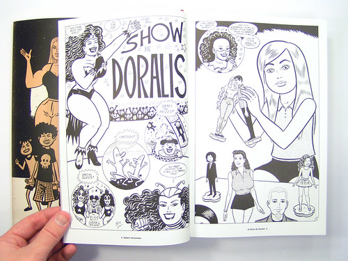
4.    Love & Rockets, Los Hernandez Bro. (comic)

5.    The Venture Bros. (tv)
6.    Eightball: The Death Ray, Ice Haven, and David Boring by Daniel Clowes (comic)

7.    Lost in Translation (film)
8.    Teaching Visual Culture: Curriculum, Aesthetics, and the Social Life of Art by Kerry Freedman (text)
9.    Asterios Polyp, David Mazzucchelli (comic)

10.    Eagles Of Death Metal-Peace Love Death Metal (album)
11.    The Royal Tenenbaums (film)
12.    iPod/iPhone (tec)
13.    Takashi Murakami ("fine art")
14.    Jason’s Hey Wait!, Why are you Doing This?, I Killed Adolf Hitler (comic)

15.    Pixar (films)
16.    Shag ("fine art")
17.    Freaks and Geeks (tv)
18.    The Daily Show with John Stewart (tv)
19.    Mad Men (tv)
20.    The Adventures of Kavalier and Clay (novel)
21.    Mario Galaxy (video game)
22.    The Complete Calvin and Hobbs-Bill Watterson (comic)

23.    From the Lower East Side to Hollywood: Jews in American Popular Culture by Paul Buhle (text)
24.    The Comics Journal (magazine)
25.    White with Foam, Mad Love (album)
26.    Optic Nerve, Adrian Tomine (comic)

27.    The Cheese Monkey-Chip Kidd (novel)
28.    Krazy & Ignatz, George Herriman (comic)

29.    Interpol-Our Love to Admire (album)
30.    Facebook (tec)
31.    Pixies (Live Music)
32.    Humbug, Harvey Kurtzman et al. (comic)

33.    Juno (film)
34.    DC: The New Frontier, Darwyn Cooke (comic)

35.    America’s Best Comics-Edited by Matt Madden and Jessica Able (comic)
36.    An Inconvenient Truth (film)
37.    Ghost World (film)
38.    Carnival (tv)
39.    Sabra Fields ("fine art")
40.    McSweeny’s Quarterly No. 13 –Edited by Chris Ware (comic)

41.    Blackalicious-Blazing Arrow (album)
42.    Elf (film)
43.    Justice League Unlimited (tv)
44.    Cirque De Sole (live performance)
45.    Wii (tec)
46.    Robert C. Jackson ("fine art")
47.    Tom Strong, Alan Moore & Chris Sprouse (comic)

48.    It's Blitz!, Yeah Yeah Yeahs (album)
49.    Weeds (tv)
50.    Fantômas-The Director's Cut (album)
51.    System Of A Down-Toxicity (album)
52.    NPR (radio)
53.    Tomahawk-Tomahawk (album)
54.    Lord of the Rings (films)
55.    MSNBC (tv)
56.    Dan in Real Life (film)
57.    Whip It! (film)
58.    Judd Apatow’s Films (films)
59.    The Complete Peanuts, Charles M. Schulz (comic)

60.    Spider-Man II (films)
61.    Jack Cole and Plastic Man –Art Spiegleman and Chipp Kidd (text)

62.    Dillinger Escape Plan-Irony Is A Dead Scene (album)
63.    O’Brother, Where Art Thou? (film)
64.    Simpsons (tv/film)
65.    Orbital-The Altogether (album)
66.    Lost (tv)
67.    Iron Man(film)
68.    Promethea, Alan Moore & J. H. Williams III (comic)

69.    Thursday Comedy Primetime on NBC (tv)
70.    X-Men II (film)
71.    Battlestar Galactica (tv)
72.    Everything is Illuminated (film)
73.    The Family Stone (film)
74.    The Great Women Cartoonists-Trina Robbins (text)
75.    Shepherd Farley ("fine art")
76.    Fair Weather, Joe Matt (comic)

77.    Gorillaz-Demon Days (album)
78.    Star Trek (film)
79.    George Sprott, 1894-1975, Seth (comic)

80.    Sponge Bob Square Pants (tv)
81.    Secret Chiefs 3-Book Of Horizons (album)
82.    Big Love (tv)
83.    Little Miss Sunshine (film)
84.    The Fog of War (film)
85.    Hellboy (film)
86.    Fantomas-Melvin’s Big Band(Patton), Kid 606, Lucky Stars (live performance)
87.    Doubt (film)
88.    The Authority, Warren Ellis & Bryan Hitch (comic)

89.    Milk (film)
90.    The Powerpuff Girls (tv)
91.    Avengers Forever, Kurt Busiek, Roger Sternand & Carlos Pacheco (comic)

92.    V for Vendetta (film)
93.    The Golem’s Mighty Swing, James Sturm (comic)

94.    Stranger then Fiction (film)
95.    Firecraker (film)
96.    Bjork, Yeah Yeah Yeah’s (live performance)
97.    Roketo (comic)
98.    SNL (tv)
99.    That ‘70’s Show (tv)
100.   Munich (film)

Wednesday, December 23, 2009

Fall 2009 Comics Readings Reviews


It is within the pages of W.K. Brown's fictional fiction by Chris Ware that we finally get more then the predictable creep/nostalgia and "oh look what he did here" revelations (always brilliantly done, but now almost never living up to our expectations…the price of success for Ware).  The irony is it is a Science Fiction story that makes this the best comic I have read recently without the necessity of comparing it with its contemporaries.  It is this story that the Rusty Brown story expands enough to make me enjoy it, as I did the Jimmy Corigan plot.  Its all fantasy, although Mr. Ware appears in Rusty’s school in previous issues.  The explanation provided for W.K. and Rusty’s pathetics are provided skillfully in this issue.  However, all of that plays a secondary role to the introductory story about a Mars colonization.  It quite literally is everything comics should be.  Not because it is science fiction based, but because not an ink stroke, a word, a panel, a color is wasted.  Each is necessary and each supplants itself as a storytelling mechanism that provides revelations and reflections.  It is a well contained piece of fine art encapsulate in sci-fi nostalgia, the type you would suspect W.K. might have written, but also be paralyzed by.  While ACME Novelty Library No. 19 continues the dissection of people who deserve no sympathy, you are sympathetic to the Pulp art one of them creates as a dissection of people who deserve no sympathy.  It is redemption without appeasement. Grade: A

I don’t love Humbug, but I don’t have to.  It is rewardingly strange to look into this time capsule so precisely capsulated. In it you find explanations for context lost in time.  Nevertheless, the truth is you are seeing an artistry whose context can never be fully conceptualized because of that lost time.  You simply gaze at it with wonder and reverence for the influence it represents and the qualities you can pull from the depths of your nostalgia.  Harvey Kurtzman’s influence on American culture is legendary.  His band of skilled misfits, Will Elder, Arnold Roth, Al Jaffee and Jack Davis are all brilliantly displayed.  But for me packaging, joke nick knack adds, cleverness and influence aside.  I hold onto it with awe, because of Jack Davis’s line work.  I could just simply stare forever. Grade:A-
George Sprott is huge, the book is physically, making it hard to read in bed, but easy to enjoy.  Seth’s graphic design skills have been evident in his collections of Charles Shultz’s Peanuts; they continue here.  Apologetic nature of the storytelling fits the protagonist and his charming flaws.  This mystery lays out naturally awkward and meticulously refreshing.  There is nothing left secret beyond any storytellers knowledge, but there is no moment where you feel his era of muted exploitation and crassness is betrayed.  It is a book that is honest to the era in both revelations and social convention, despite being fiction.  Very Seth. Grade:  A-
J.H. Williams III’s work with Alan Moore has been inspiring, and occasionally bewildering.  With Greg Rucka it is has surprising clarity. Your mind is captured into Batwomen’s world with a innovative two-page layout, and you are not let go of the intense insanity she is subjected to. You catch onto what all the buzz is about. And just like that the dreaded words…”to be continued.”  Followed by a less then satisfactory story about and equally interesting character The Question…and once again you are reading the plight of superhero comics for the past 20 years.  You question why you have ventured back into the mainstream.  Grade:B
I realize Matt Madden, Jessica Abel and their guest Charles Burns have a new book out of The Best American Comics for 2009…but I will not be reading that till mid 2010.  In 2008, however, guest Lynda Barry pieced together a collection that ultimately left me critical of her selections.  But included much of my favorites, Ware, Seth, Jamie Hernandez, Alison Bechdel, Matt Groening ect… (of course I already had most of that already).  I pick this collection up to find that which I was unaware of.  Only one immerged from this, a story by Shawn Cheng and Sara Edward-Corbett.  Even more disappointing is there were many stories by cartoonists I admired that I just couldn’t get into and much by people I had not heard of, that I detested.  Then there is the list of notables not making the collection, people you are friends with and/or comics you loved.  Nevertheless, such is the way with art.  Don’t take my word for it, check it out.  Barry took on a thankless task and I can only hope I make the notables list myself someday. Grade: B-
I prefer to make silent comics.  I would also prefer that there were more of them.  It is more intimate.  The Goon by Eric Powell is a City of Lost Children meets On the Waterfront.  It exploits typical cartooning ventures, humor, violence, and sex.  However, it does not really matter that you have read or seen this story many times before.  It is fundamentally sound and well presented; so its fun.  So what?! Grade:  B-
This Fantastic Four story has two things going for it; being self contained and Bryan Hitch.  Not the best story, but it is well told.  Given the state of endless cross overs and hacks in comics, it is hard to not appreciate the quality here.  Just don’t get use to it.  You are setting yourself up for disappointment. Grade: B-  
Somehow, Williams channels Mazzuchelli in the flashback sequences in this issue of Detective Comics.  It is nice to have the time in this tale to explore her character more and balance of honor and sexuality.  Honestly though I could do without the Wolf Man…she does seem to be making a reluctant power play like Storm did with the Morlocks.  Which is always cool...but then more Question. Grade:  B-
At some point Burbaker and Hitch lost my interest…I think it was the always over acted final/to be continued splash page.  John Cassaday’s cover is brilliant and there is really beauty in Hitch’s work almost always.  I was surprised to enjoy the loosens of the inking. Grade: C+

As people I love Amanda Connor and Jimmy Plamiatti, so I picked up Power Girl with high hopes.  It was ok in many respects, but ultimately I felt Connor’s style suited the story best when it was light and campy.  Which is actually a great thing if we are marketing towards a younger crowed.  But it is hard to make that case when you have useless panty shots and you do not fix Power Girls window issue (see other blogs).  So I walk away respectful, but kind of eh. Grade:  C+

Longshot is my favorite superhero, so naturally I have an affinity for Chris Claremont and Art Adams’ X-Babies and Mojo’s world. Jacob Chabot’s drawings are pitch perfect for a comic for kids about child versions of the X-Men.  The story doesn’t take itself seriously…its fun.  But I was disappointed by the introduction of another villain beyond Mojo…he was weekly designed and annoying.  I was even more disappointed at the sort of bla bla bla approach they took to one of my favorite villains ever, Spiral.  But hay its for kids. Grade: C+
Arkham Reborn in a vacuum might be a good book.  But just in contrast with Batwomen in Detective Comics you get the sense that they story, art and dialogue is forced.  That the idea was good in some meeting, but should have been pulled well before inks were added to the pages. Grade: C- 
When your favorite parts of the comic are the cover and six pages of a well acted talking head, you know you just aren’t digging the comic.  Honestly, I just read it and I can’t remember much about it.  I know the villains were not that compelling…also another sign that it’s not the book for you.  Sorry Tony…once again, I don’t get you.  You were great on the big screen. Grade:  C-

I hart Legion and have a soft spot for the New Mutant’s.  This was not the worst drawn book, nor was the writing always predictable.  Nevertheless, the over all story and storytelling just left me wondering, why are they wasting away such great characters with over done approaches. Grade: C-

 The cool thing about this book is the Joker’s line to Batman after watching him kick the crap out of some villain; “I know we have our differences, but I must admit it’s a pleasure to watch you work! Seriously.” There now you don’t have to buy this disappointment.  Thank goodness, things pick up in this series when Batwomen arrives. Grade: D


Honestly, I think I read this Astonishing X-Men story before, but enjoyed it.  It is a poorly tapestried collage of nostalgia, that is literally airbrushed into fooling you to think it is somehow more hip, because it looks so less cartooney.  We it is not, it is muddled and all that I love is washed away with this approach.  And I thought plot when the Uncanny X-Men moved to Oakland was bad…and I am from the East Bay. Grade: D-


The Amazing Spider-Man is Marvel’s flagship.  A cover by SKOTTIE YOUNG is absolutely deserving.  So why oh why is the inside about Expletives Deleted, emaciated spaghetti sex kittens, dead pool at his least funny, and spider-man drawn like plastic man gone on crack…and don’t get me started on the inking.  The entire comics is basically the cartoonist version of illegible.  This should be the highest quality and most accessible book…your owned by Disney now…would they do this to Mickey? Grade: F


Tuesday, December 1, 2009

Form and Function: The Power Girl Controversy

With a great deal of agreement, admiration and old friendship, the following is in response to Kelly Thompson's She Has No Head!-The Boob Window That Just Won't Die. Part of an on going debate over the latest explanation of Power Girl's costume:


I am in no position, nor do I want to be, to criticize what other heterosexual males find attractive in females.  In fact, I am huge supporter of those who somehow have remained uninfluenced by the incessant cultural onslaught defining what we should like; whether it is the fashion industry, comics, Hollywood, animation, our families, or porn.  I have collected enough anicdotal evidence to be convinced that veriety in preference is attainable. However, the truth is we have lost control of our individual impulses as much as our mothers, sisters, lovers, and daughters have lost control over their satisfaction with their physical identity.


It is the rule, not the exception since the onset of, what I like to call, the McFarlane era that women are depicted with statically improbable proportions. An hourglass form that takes the Barbie proportions to an extreme.  Depicted with breast that often are so absurd that they warrant mockery, except for the fear that their depiction has on adolescences.  For more evidence, you need not look further then Kelly Thompson's previous blog.
 
Perhaps some reality is appropriate to ground our assessment.  According to a study by North Carolina State University, approximately 46% of American women are "banana" shaped (less then 9 inches smaller then hips and bust measurements), while just over 20% are "pear," 14% "apple," and 8% "hourglass.”  In another study it was determined that the average American waist measurements have increased by 6 inches in the past 60 years.  There have been a number of studies done about the increase in breast cup size as well.  Some, but not all, of this can be explained with eating habits and our more sedimentary life style here in the US.  This does not fit with the expanding bust and shrinking waist in superhero comics.


What is plainly true is that not since the 1920's when "banana" was in, have our cultural preferences on female form been in-tune with the typical realities of the female members of our community.  When our preferences as a culture and our physical realities are not aliened, it becomes increasingly disruptive for both males and females.


The depiction of women in comics has not led they way in over a generation, but it continues to influence those in other areas of pop culture who do.  I am not saying it brainwashes the individual to be attracted to a particular type.  I am also not one to jump on the "media arts" are corrupting our society bandwagon.  The Arts reflect our culture far more then they influence it.  I have said in a previous post that our declining art education, focused on a visual lexicon, has contributed to visual communication more easily manipulating us and/or confusing us.  As well as, resulted in a decline of quality in some media arts visual communications.  I do, also, think media arts communicates a broad cultural consciousness that encourages you to suppress your impulses, question your thoughts and examine yourself in an unhelpful way.  This can fester into pervasive problem in some individuals that result in real world problems in relationships, self-esteem, productiveness, social interactions, and serious physical health and longevity issues.


Power Girl alone is innocuous, but due to the depiction of the vast majority of female characters in American superhero comics over the past two decades and PG’s proportions, the issue we are now focused on (yes pun) that deserves some real criticism.


Lets discuss the most legitimate defense.  It is comics, it is a cartoon, it is supposed to be out of proportion, it is an exaggeration of reality to bring more to the clarity of the story.  All true.  I am a cartoonist, and I will go to the mat defending the right of cartoonist to depict outlandishly to serve the aesthetics and visuals to communicate the story.  Lets get real here, this is lazy cartooning.  As established above you can’t have all of your characters have the same persona and visual dimensions.  The story becomes so carbon copy that even I cannot defend it.  I love the aping traditions in comics.  I think it has been an essential element contribution to Post-Post-Modernism in fine art (I smell a future post).  There certainly are artist out there who I tend to give a free pass, like R. Crumb, because he depicts females utilizing his fantasy, a fantasy that is the antithesis of the contemporary superhero comic (and I happen to prefer it myself, despite it also being exploitative on a underground scale…see bellow).  But in this context it is lazy of a cartoonist to consistently depict exploitative body type on all of its characters, male or female.  What makes it even worse is when these absurd proportions have become so iconic that it travels with the character from artist to artist, as is the case with PG.  It would be ok if she were depicted in a universe with the variations on female form we find in Love and Rocket’s.  But that is not often the case. 
 
Also discussed in Kelly Thompson's previous blog. Was the issue of balloon like breasts.  A fellow alumni of Kelly’s and mine from SCAD’s Sequential Art department, Renné Alexander use to have a texture on how to draw women’s breast.  This was necessary, despite extensive life drawing classes, because many boys and a few girls in our department were brain washed by the McFarlane era and some Manga.  I would speculate that these basic understandings of the female form and gravity have served these cartoonists well in terms of visual storytelling and improved their personal lives.  As Kelly railed on the lack of clarity in muddle page layouts and cluttered panels (another sign of lazy, not talented, cartooning), it also makes sense in terms of clarity of story that diversity and believability in depiction of all forms even if they are exaggerated help the reader. 


I am no fan of the idea that female cartoonists get a free pass.  Amanda Connor taking on Power Girl does not automatically result in the disarmament of the minefield that is Power Girl.  However, she is handling it just about as well as anyone could.  The book is helped by variety of body types depicted.  Amanda and Jimmy Palmiotti played a small, but quit helpful role in my comics education and I also feel they are just about the best combination of bad ass and sweet you can get.  This clearly comes out in their comics.  While I take issue with some of their depictions, like needles panty shots, it is really how accessible the book is, not inaccessible that I have modest issues with.  The book feels like it is written for kids at times, but then the devil is in the details.  And sometimes I think, you know this may not be appropriate, despite the light heartedness of it all.  As Kelly point’s out Conner does not save it from the iconic problem.  While, Jen Van Meter (image above) just insults us.


There are male superhero cartoonists who have managed to depict women in comics with admiral variety and proportions.  Alan Davis, Darwyn Cooke come to mind, both you cannot argue are not exaggerating the female form, but the verity is there and the grounding in fundamental understanding of anatomy is too.  


For full disclosure my argument hear is not without masculine fetished clouding of judgment.  As mentioned above I do appreciate Crumb’s depiction of women, and not entirely on the principle here, but also from like-minded perversions.  I am a fan of Davis’s depiction of Meggan and Cooke’s depiction of Wonder Women for similar reasons.  It is no mistake that form comes into play with my favorite Love & Rockets characters; Maggie, Danita Lincoln, Vivian "Frogmouth" Solis, Petra, and Doralis.  All are voluptuous hour-glass.  But this not the BBW/FA excuse (Big Beautiful Women/Fat Admirer…totally STUPID terms, real I kid you not).  Ugly is still ugly, no mater the size or gender.  But comics should depict the character in terms of dialogue, narrative, thought, sound, action, and form.  Ugly is ok, even brilliant (see Dan Clowes).  If I respond to one character more it may have to do with form.  But, I should not be betrayed by sloppy storytelling and a lack of contrasting images to heighten my awareness of the characters place in the story. 


The other issue I have with this from an aesthetic perspective is that less is more, not just in terms of clarity of pages and panels, but also in terms of the seductiveness of the character.  Which from my understanding of Power Girl has little to do with her as businesspersons, family member, and local hero.  But if you were to play that up, wouldn’t you want to head the advise of many mothers over generations and strip club owners…keep them wanting more.


Some say this is a fashion issue.  Fashion is an issue (see my next blog).  But unfortunately for Power Girl the window has become synonymous with her iconic form and now there is an infinitely dumber explanation to go with it.

I the concept that somehow the statuesque is puling in new young readers, and as some friends have suggest to me, Kelly and others should move on to read Vertigo.  There is no ethical and non insulting reason that all comics should strive to represent fundamentally strong storytelling elements and technically professional approaches to cartooning.  This includes how women are depicted in comics.  The eye candy aproach limites the potential sale of a comic.  Comics should be made to be assesible and not personally insulting both in depiction and exsplination.  To continue on is to limit comics potential and undermine the bottom line.  Young readers have plenty of other sources of entertainment, it is time that comics including superhero comics consistently present quality that builds intelegence and ethical standers.  To not do so, is to side with villany and stupidity.


I’m talking too much again.  I’ll shut up.